I am out of the office until 12/4/79.
Please feel free to contact me, and I'll get back to you upon my return.
Art of Manliness Pocket Guides
I had an opportunity to help lay out two books for Art of Manliness.1 Both took a pocket guide format, styled to a particular theme and era.
The Pocket Guide to Action
The first included a series of individual meditations, and was to be designed in the style of a WWII field manual. Which is a fairly dense, workmanlike, masculine, and old-fashioned look.
The title page.
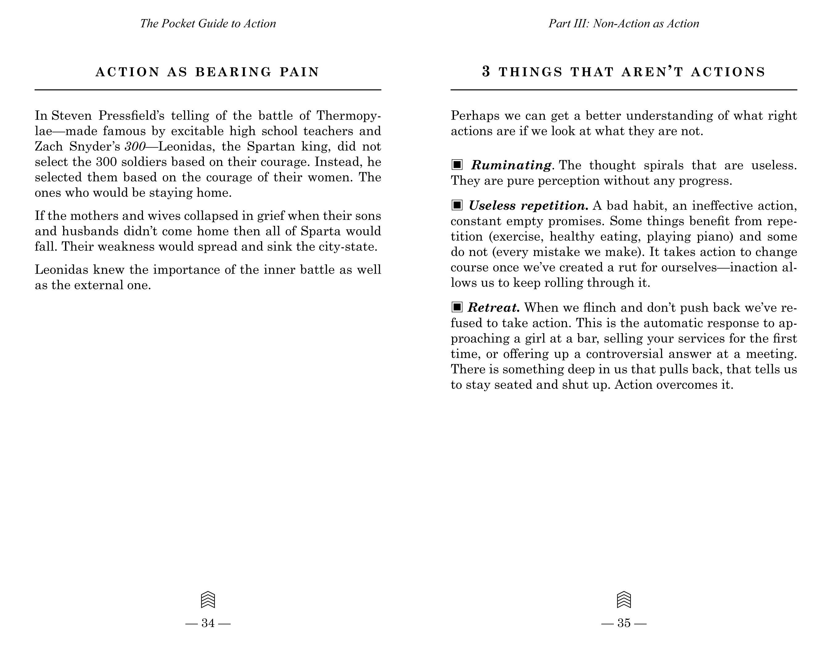
I worked to evoke the style of the period, but also kept modern readers and their expectations in mind. I selected typefaces or typeface classes that were in use in the U.S. between 1930 and 1950.
Because we built a text-only layout, I supported the text with layout and conservative ornament suitable for the theme.
The Strenuous Life Handbook
The second was a collection of goals for personal growth, presented as merit badges to be earned by completing certain tasks.
The title page. To suit the theme, I chose a 1960s Boy's Life / summer camp look.
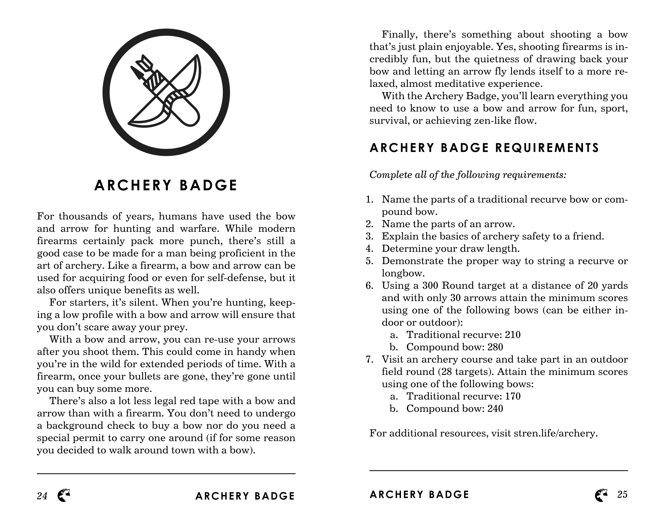
Each section included a badge graphic (provided by the client), along with a list of objectives necessary to earn it.
I have a real fondness for the typography and layout styles of the past, so it was a real joy to be a part of this project project.