I am out of the office until 12/4/79.
Please feel free to contact me, and I'll get back to you upon my return.
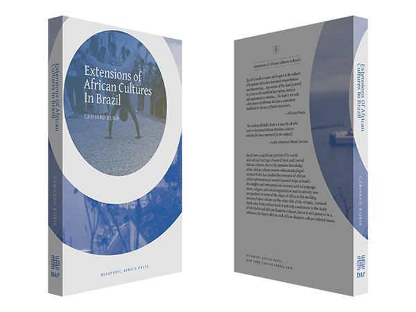
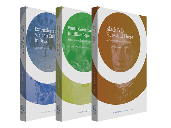
Diasporic Africa Press
Diasporic Africa Press is a nonprofit publisher focusing on works that describe African cultural impact. I’ve worked with the publisher for a while, and we recently worked together to build a fresh style to flow through the works—a style that suits the content while keeping each book’s style consistent but distinctive.
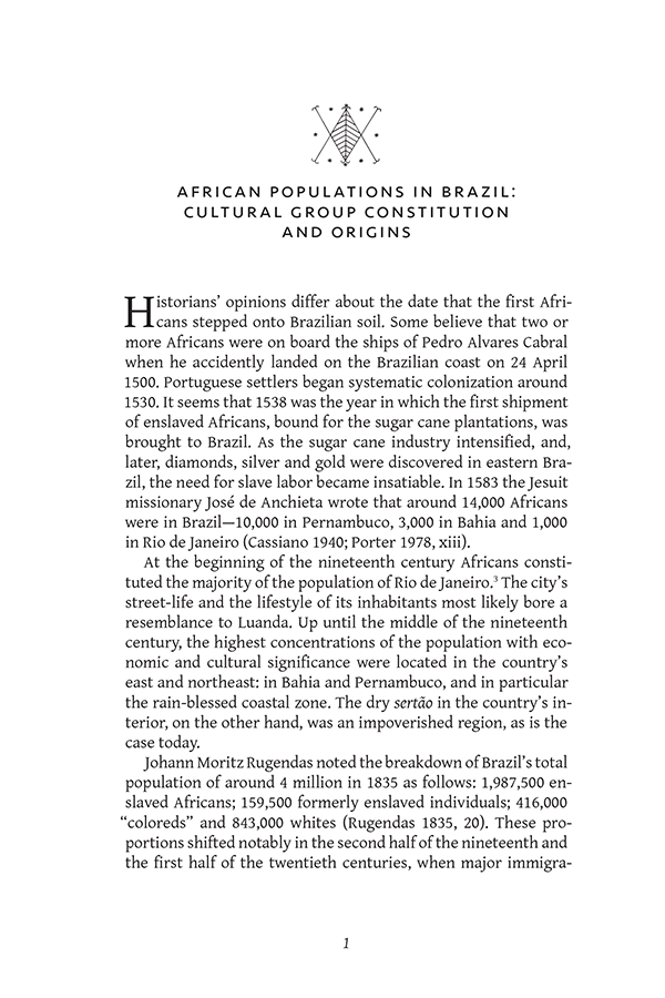
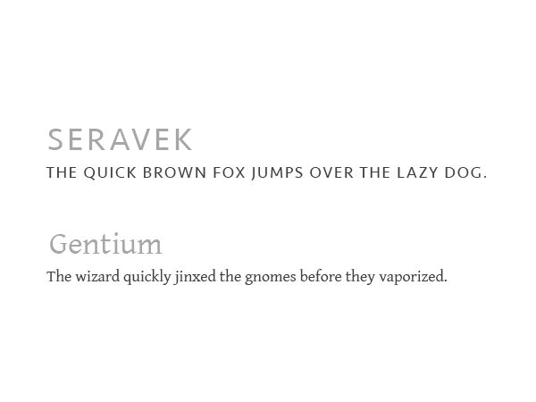
Many of the works include special characters, and I wanted to choose a typeface for body text that was flexible enough to handle this reliably while still carrying an appealing look. I chose Gentium:
…a typeface family designed to enable the diverse ethnic groups around the world who use the Latin, Cyrillic and Greek scripts to produce readable, high-quality publications. It supports a wide range of Latin- and Cyrillic-based alphabets.
I chose Seravek as a complement—it also has fairly strong support for special characters, and the pair looks great together.
Phillip and I have worked together for a few years now and with each project he has devoted himself to the task and will not quit until the job is done to satisfaction. Very personable and detailed-oriented, I recommend him highly!
Kwasi Konadu
I always have a blast designing books for Diasporic Africa Press—largely because I always manage to learn something new as I work through them. To find out more about the publisher, including their aims and information on available books, check out dafricapress.com.